
Imagine you’re standing inside an art gallery filled with hundreds of portraits. Each artwork represents a feature — age, income, education, spending habits, location, and beyond. As the curator, you must decide which few paintings best represent the entire collection without losing the essence of the story they tell. This act of finding the most expressive, least redundant pieces is exactly what Principal Component Analysis (PCA) does for data. It condenses information while preserving the beauty of variation.
When Data Becomes Too Crowded
In the digital age, data is like an overfilled gallery — overwhelming, complex, and sometimes chaotic. Each feature adds depth, but too many create clutter. In machine learning, high-dimensional data can lead to what’s called the “curse of dimensionality,” where models become confused, slow, or overfitted because they’re trying to interpret every brushstroke instead of the whole picture.
PCA steps in like a skilled curator, rearranging the gallery. It identifies the directions — called principal components — along which the data varies the most. Then, it reorients the dataset along these directions, capturing as much information as possible with fewer dimensions.
In a data analyst course, learners quickly discover that PCA isn’t just a mathematical trick; it’s an act of simplification without surrender. It helps analysts navigate oceans of variables by focusing only on the ones that truly shape the tide.
Variance: The Pulse of Information
Think of variance as the heartbeat of your data — the measure of how alive and dynamic it is. PCA’s mission is to preserve this pulse while trimming unnecessary noise. Instead of looking at data in its original form (with all features interacting chaotically), PCA finds new axes — linear combinations of the original ones — that capture the greatest possible variance.
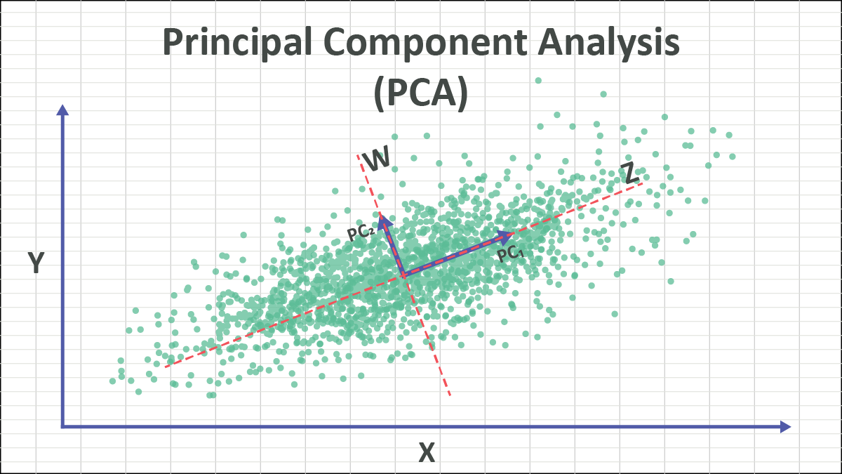
Imagine standing in a field surrounded by scattered points representing data. PCA rotates your viewpoint until you’re looking straight down the direction where the data spreads the most. That direction becomes the first principal component. The second component is then chosen perpendicular to the first, capturing the next highest variance, and so on.
For learners exploring practical statistics through a data analyst course in Nashik, visualising PCA often feels like switching from a cluttered spreadsheet to a crisp aerial map — suddenly, relationships become visible that were once buried in the noise.
The Geometry Behind the Magic
Behind PCA lies elegant linear algebra. First, data is standardised — centred around zero mean and scaled to unit variance — so that each feature contributes equally. Then comes the covariance matrix, a blueprint showing how features move together.
By performing eigen decomposition on this covariance matrix, PCA extracts eigenvectors (directions) and eigenvalues (magnitudes of variance). The largest eigenvalues correspond to the principal components that explain the most variation in the data.
In essence, PCA performs a coordinate transformation — projecting data from its original axis system into one where the axes are aligned with maximum variance.
To put it simply, it’s like adjusting a camera lens until the picture comes into perfect focus. You’re not changing the scene — you’re changing the way you look at it.
Dimensionality Reduction in Practice
Why does this matter? Because real-world data rarely comes neat and compact. Financial analysts deal with hundreds of economic indicators. Healthcare models analyse dozens of biomarkers. E-commerce datasets track countless customer behaviours. PCA acts as a filter, distilling this complexity into a manageable number of dimensions that still hold the essence of the data.
For instance, in image recognition, PCA can reduce thousands of pixel values into a handful of components that still capture the face or object’s identity. In finance, it can summarise multiple correlated stock indicators into composite indices that explain market trends.
In practical terms, using PCA before model training speeds up computation, reduces redundancy, and often enhances predictive accuracy. It’s no wonder that every data analyst course introduces it early — because mastering PCA means mastering clarity amid chaos.
PCA’s Role in Storytelling and Insight
Numbers alone rarely inspire action. It’s their patterns — the shapes of variance — that reveal meaning. PCA uncovers these shapes by stripping away the redundant layers and exposing the structural core of the data.
In marketing analytics, PCA can reveal the dominant behavioural patterns among consumers — like identifying that spending habits are driven primarily by lifestyle rather than geography. In scientific research, it helps visualise multidimensional relationships that words or tables cannot describe.
For learners enrolled in a data analyst course in Nashik, PCA often feels like learning to read between the lines of data — a skill that turns raw figures into narratives of correlation, influence, and cause.
The Art of Knowing What to Keep
The real mastery of PCA lies not in computation but in interpretation. Deciding how many components to retain is a creative judgment. Analysts often use scree plots to visualise eigenvalues or apply the explained variance ratio to decide when enough information has been captured.
But PCA isn’t without trade-offs. Reducing dimensions can obscure interpretability — the new components are combinations of original variables, not direct measures. Hence, the art lies in knowing when to simplify and when to preserve detail.
Conclusion: The Elegance of Less
Principal Component Analysis is data’s way of achieving minimalism — keeping what matters, discarding what doesn’t, and revealing structure beneath complexity. It transforms cluttered datasets into concise, powerful representations of reality.
For anyone pursuing a data analyst course in Nashik, PCA becomes more than a mathematical topic — it’s a philosophy of analysis: to see more by looking at less. And for every learner mastering PCA through a data analyst course, it offers an enduring lesson — that insight doesn’t come from collecting more data, but from learning how to view the data you already have, from the right angle.
For more details visit us:
Name: ExcelR – Data Science, Data Analyst Course in Nashik
Address: Impact Spaces, Office no 1, 1st Floor, Shree Sai Siddhi Plaza,Next to Indian Oil Petrol Pump, Near ITI Signal,Trambakeshwar Road, Mahatma Nagar,Nashik,Maharastra 422005
Phone: 072040 43317
Email: enquiry@excelr.com